brand design | product development | Event Design | Food Photography
Cella Farms
Branding, Product Design, & Product Development for a Bay Area Food Technology Start-Up
Cella Farms is a food technology start-up based out of the San Francisco Bay Area that uses fermentation technology to transform grains into nutritious, healthy sources of protein. The first product slated for launch is a high protein sandwich bread. Cella Farms needs a strong cohesive brand presence to attract investors to get funding and appeal to customers who are looking for a healthier, equally delicious substitute for one of their staple groceries - bread.
The core idea of Cella Farms is that food choices should be easy, nutritious, and great-tasting - the “no sacrifice” choice. Its brand values are: eager, educational, and inspiring.
My Role
Creating Brand Identity, performing and analyzing Survey Research, performing R&D Product Development, R&D Baking and Food Science, Copywriting, Event Coordination and Design
The Ask
Create a brand identity that embodies Cella Farm’s brand values and can be applied to web, mobile, and print applications.
Develop a product and showcase it in professional way that demonstrates the brand values, piques consumer interest, and attracts investors.
The Solve
An eye-catching brand that embodies the brand values through bold use of color, educational copy, and inviting imagery. The applications of the logo tell a confident visual story about science-backed nutrition and health that is good for the planet and the palate.
user research
research approach
Our food and dietary choices are incredible personal. Cella Farms needed to understand what the market considerations and concerns are when choosing bread. Specifically, Cella Farms wanted to know who buys bread, their buying habits, their considerations when choosing bread, and whether there was a demand in the market for the product - a high-protein bread offering that offers no difference in taste and texture to a white sandwich bread. With these business needs in mind, I designed a questionnaire to help Cella understand the market. Those surveyed were chosen after participating in a tasting of the product. Tasting questionnaires were shared via Microsoft Forms link over email.
user insights
Taste is an incredibly important - often, the most important - consideration when considering buying bread. However, people surveyed expected and were accepting of a “healthy taste” with more nutritious breads offerings, to a point.
Convenience was the second most important consideration for most consumers surveyed; people surveyed wanted to buy their food at the grocery store at the same place where they get their other staples.
Consumers feel “guilt” about eating items with high carbohydrate content, preferring instead to eat more high protein foods, because they provide more satiety and a more optimal nutritional balance.
Consumers have a difficult time finding vegan and vegetarian sources of protein.
Brand Design
logo Design
Cella Farms’s brand values are: eager, educational, and inspiring.
The ampersand, a union of the C and F of Cella Farms, speaks to the concept of “no sacrifice.” The symbol implies a convenience and an easy choice, a product that has nutrition, taste, and value.
Some logo iterations explored the idea of playfulness, ease, and happiness. Other logo options focused on Cella Farms as a biotechnology/food technology company, rather than a food brand.
brand design
brand voice & copywriting
Cella Farms wants to attract more than health-conscious consumers, but also consumers shopping for their families. The voice and copy needs to be educational, engaging, and, most of all, accessible. For that reason, the tagline needed to be catchy and warm. “Eat What You Love & Love What You Eat” speaks to the brand’s “no sacrifice” concept whilst positioning itself in the market as a family-friendly staple. The logo is used in the tagline as the ampersand, reinforcing the idea of “no sacrifice.”
brand design
Fonts and colors
Sans serif fonts were chosen for the Cella Farms brand. Cella Farms wanted a minimal, modern, and clean brand presence. Both fonts are consistently available and optimized for print, web, and mobile applications.
Futura was chosen for the primary font of the logo because of it is timeless, bold, and consistently evocative of modernity, without looking too trendy or edgy. Cella Farms products will target those buying staples for their families, so the branding needs to be confident, accessible, and friendly.
Montserrat was chosen for secondary font applications in the logo and in body text for the brand because of its versatility and elegance.
The color #C54545 (Mahogany) was chosen after competitor research showed that the logo and packaging needed to bold colors to stand out on grocery shelves to attract buyers. Competitor colors are often bright greens and yellows. To stand out, the primary color for Cella Farms is a bold and deep red, which, while eye-catching and attention-grabbing, still stands out on a shelf.
Mahogany
#C54545
graphic design
applications
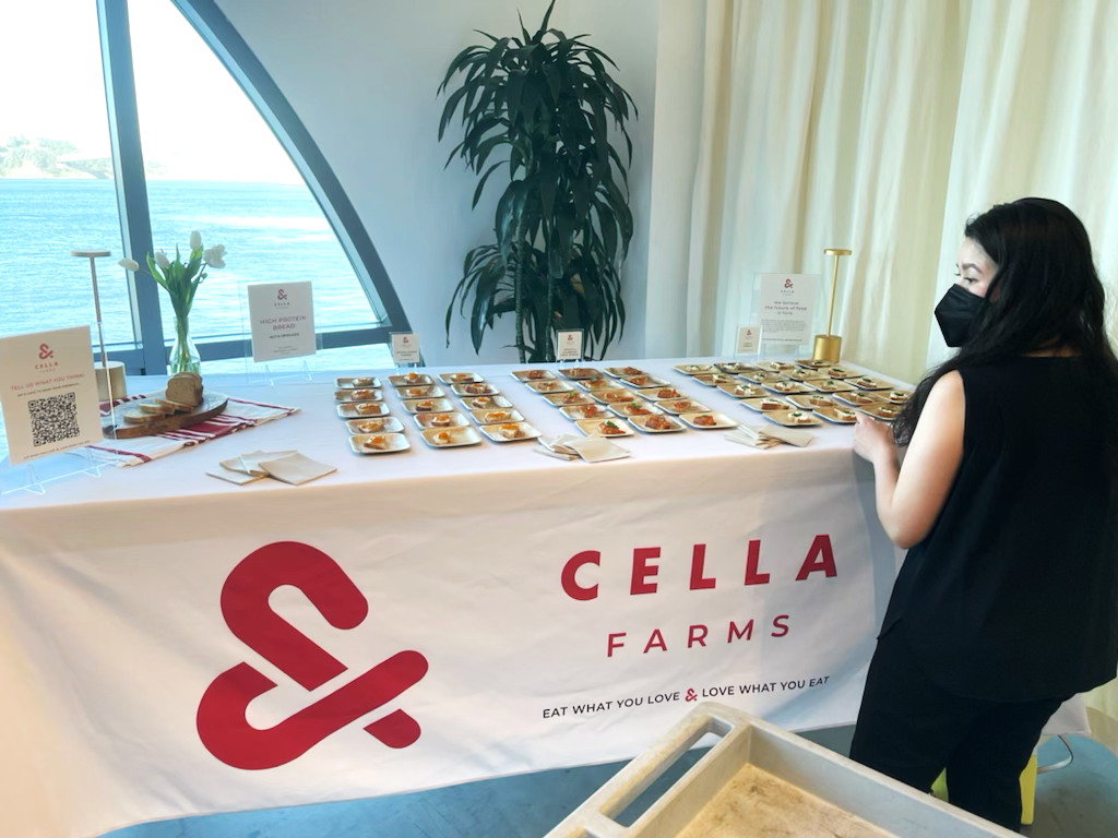
I designed logo applications for different business needs and events, such as investor meetings, conferences, and tastings. Such applications include business cards, clothing, and tasting presentation materials, e.g. tablecloths and signs.
Event Design
tastingS & Events
Survey research for Cella Farms was conducted using market research questionnaires, shared at small- and large-group bread tastings serving 200+ people. Questionnaires were distributed via email for small-format tastings and via QR code at the event booth for large-format tastings. Participants were surveyed about their dietary habits and considerations, protein intake considerations, general buying habits, and perceptions about the product and brand.
event design
product presentation
I designed the event presentation, prepared all food served at the tasting, and served the product at the event. I wrote copy for presentation materials and coordinated with events managers to showcase the product.
My work in product development included developing the recipe, baking, prototyping the product, performing texture analysis, and executing dough rheology experiments.
I took product photos for presentation and promo materials.


